Kitsune Valkyries
All-Female Esports Team
Type of Work
Research
Logo Design
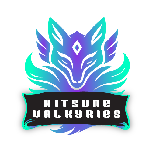
Kitsune Valkyries is an all-female competitive esports brand built around skill, unity, and presence within the gaming space. The team represents strength and confidence while fostering visibility and respect for women in esports, positioning itself as both competitive and culturally relevant.
Vision & Brand Intent
The vision behind Kitsune Valkyries was to create a logo that feels powerful, mystical, and modern without leaning into overused esports clichés. The goal was to reflect intelligence, agility, and dominance, traits commonly associated with both the Valkyrie archetype and the Kitsune fox from Japanese folklore. The logo needed to feel iconic and instantly recognizable across digital platforms.
Logo Inspiration
.png)
Logo Concept & Rationale
The fox head serves as the core symbol, representing intelligence, adaptability, and precision. Its symmetrical structure reinforces balance and control, while the sharp angles and flowing forms communicate speed and competitiveness. The glowing gradient palette introduces a futuristic, high-energy feel, helping the brand stand out in crowded esports environments. Typography was kept bold and structured to ensure clarity and impact at small and large scales.

Functionality & Application
The logo was designed with versatility in mind, performing well across social media avatars, team branding, stream overlays, merchandise, and esports visuals. Its strong silhouette ensures recognizability even when scaled down, making it ideal for digital-first applications.
See how the logo evolves into a complete, cohesive brand identity.